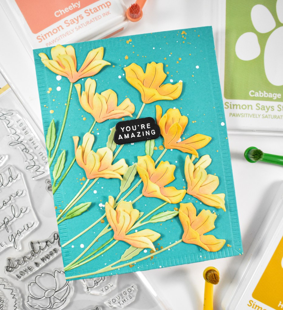
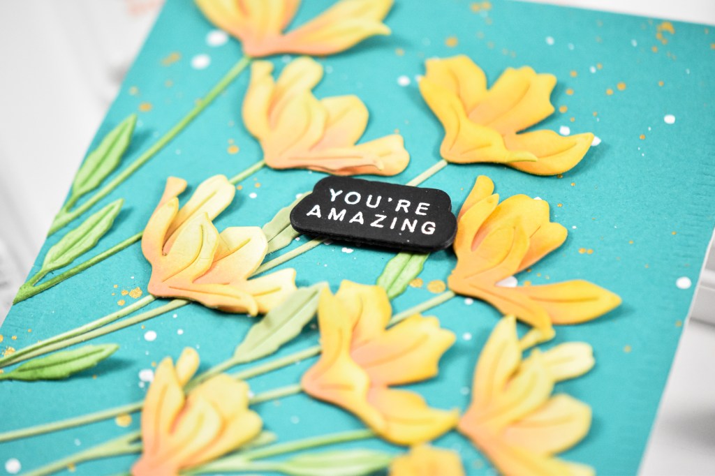
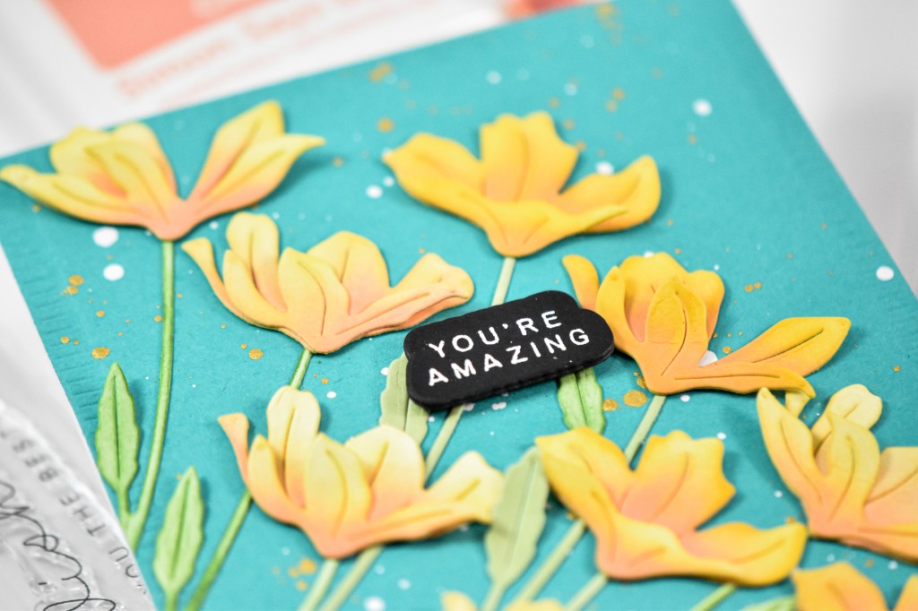
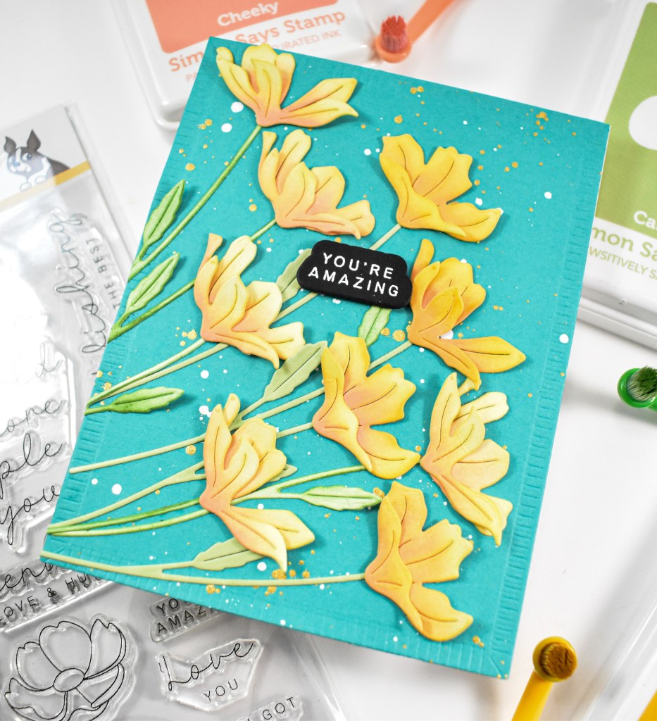
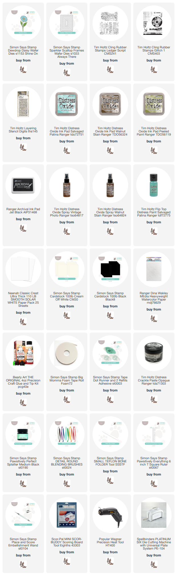
Simon Says Stamp Grungy Dewdrop Daisy

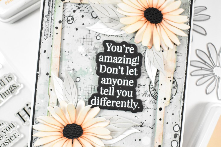
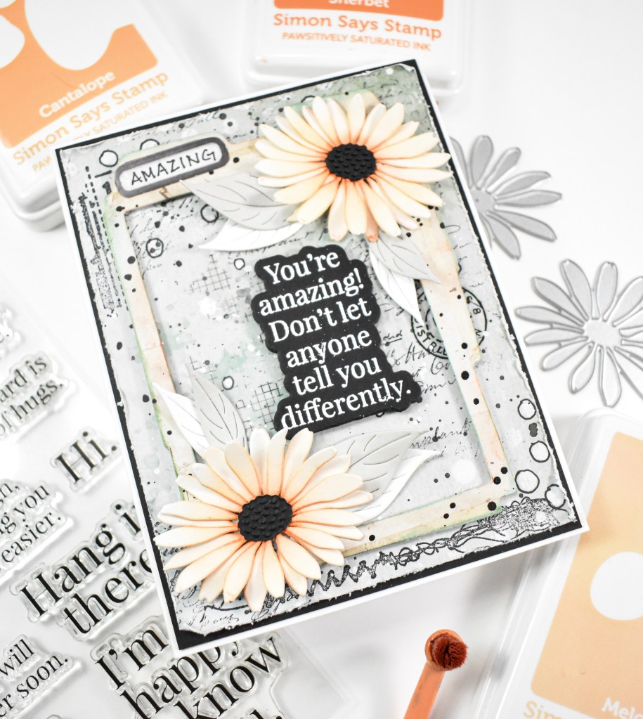
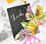
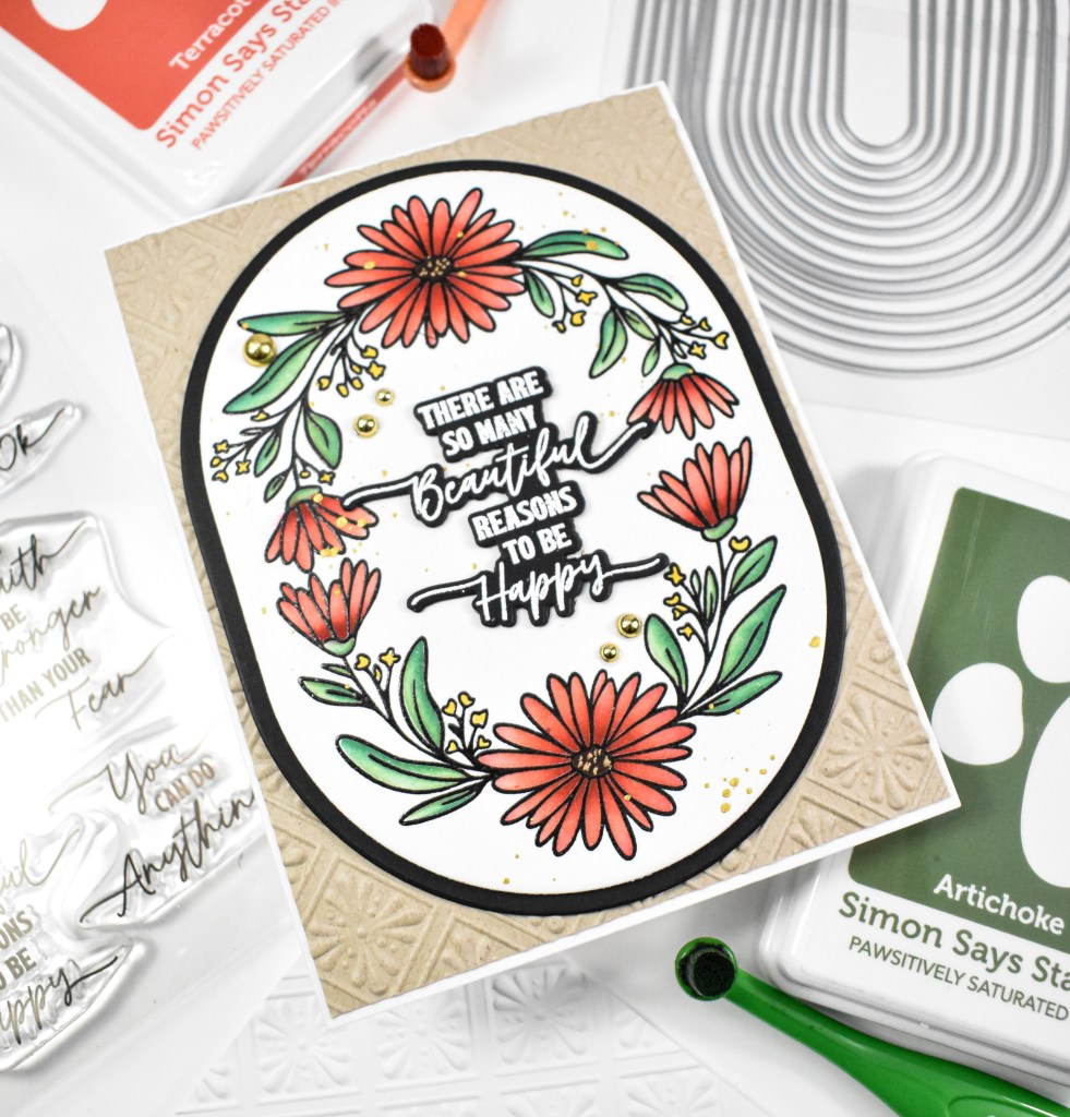
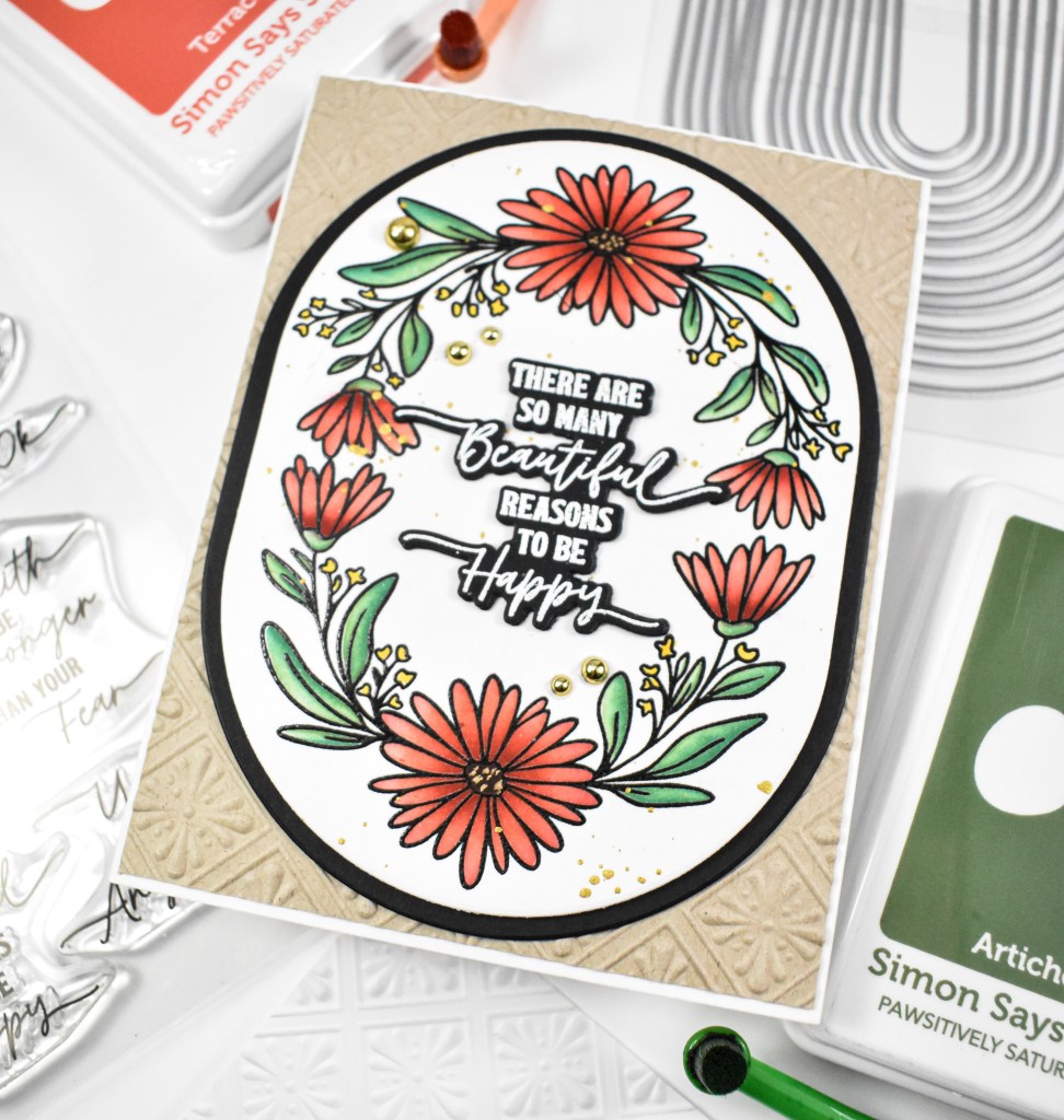
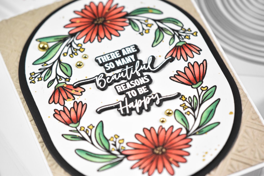
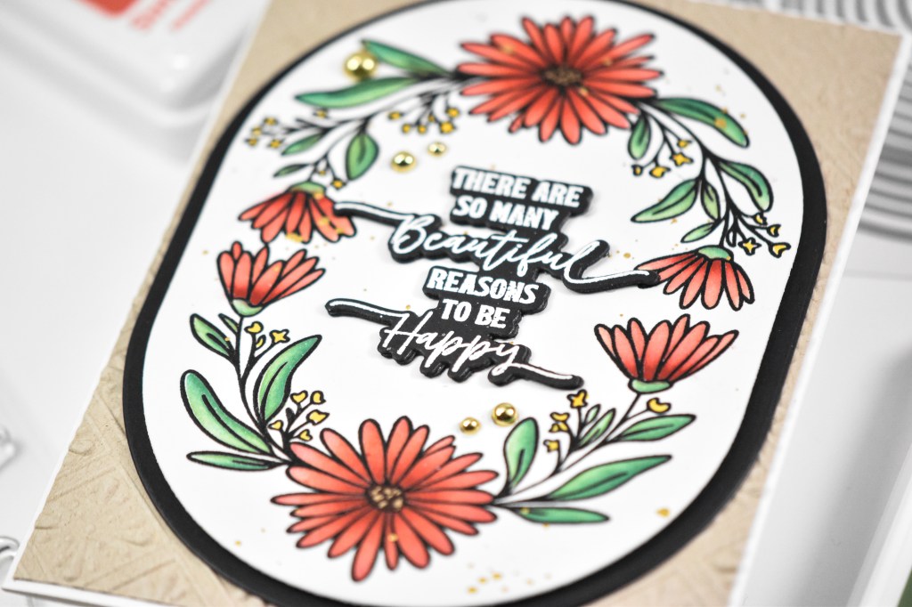
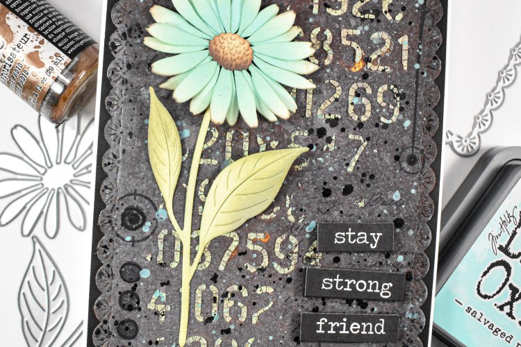
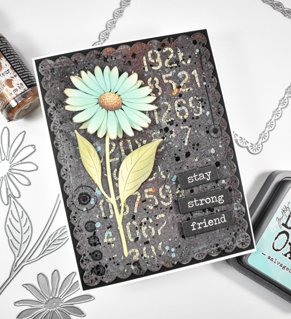
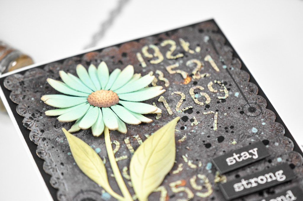
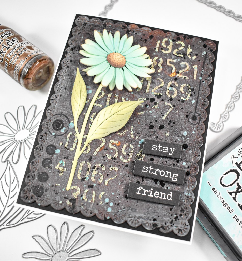
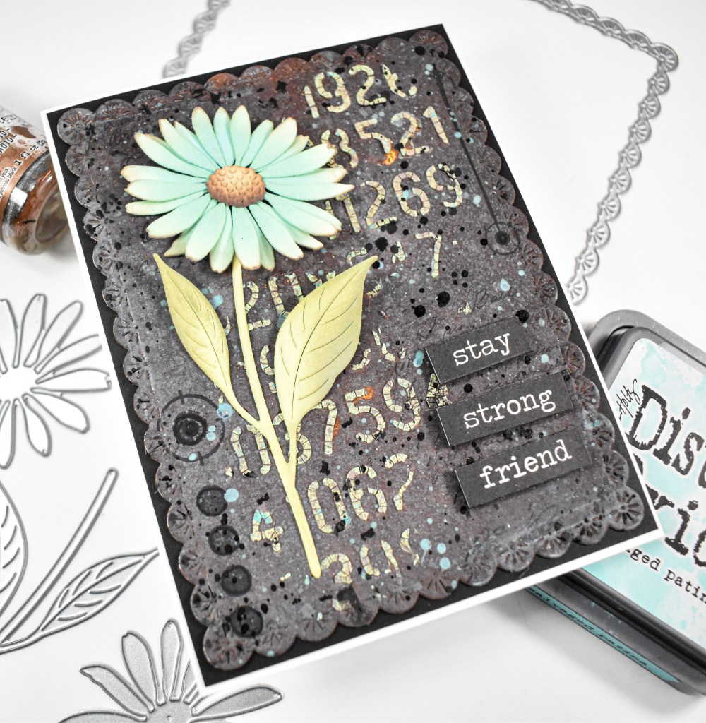
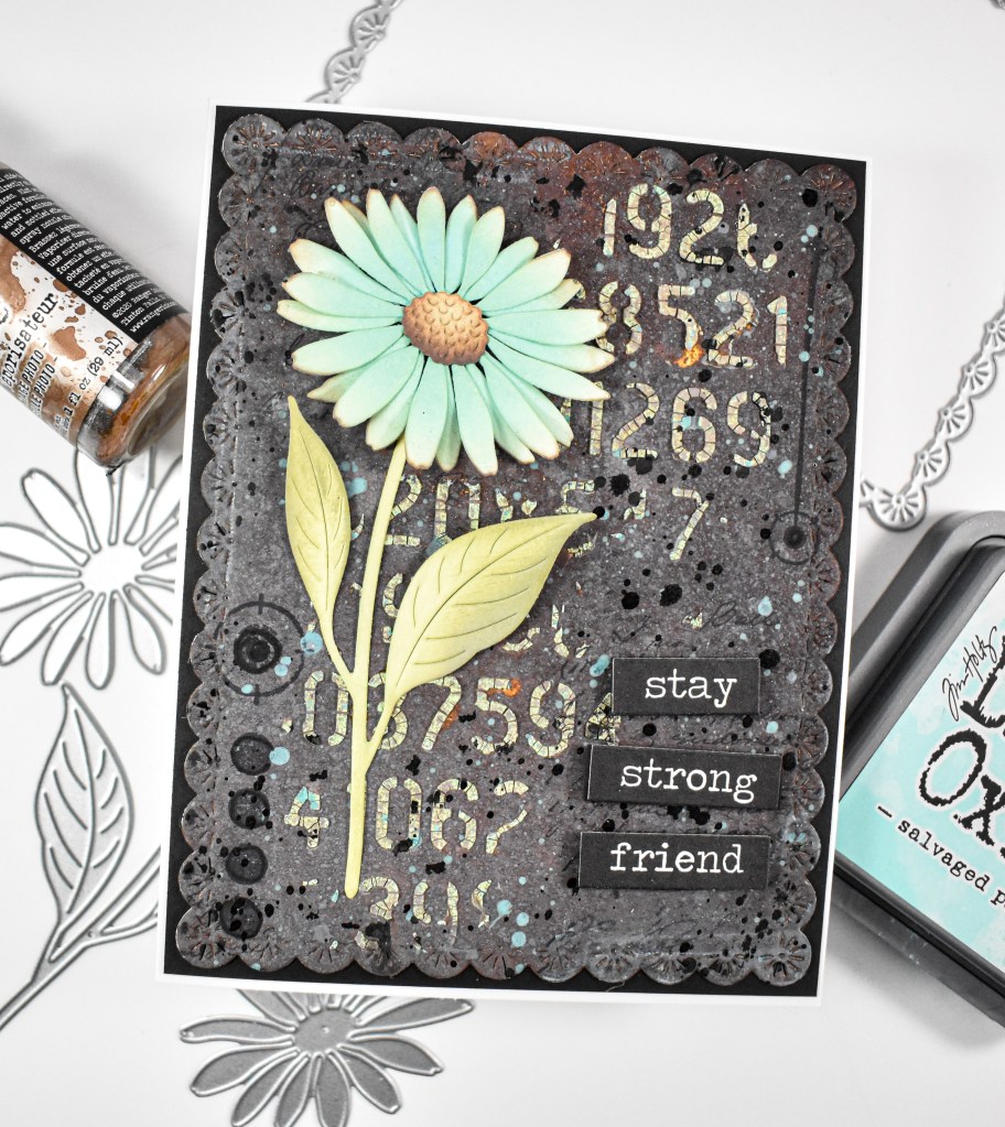
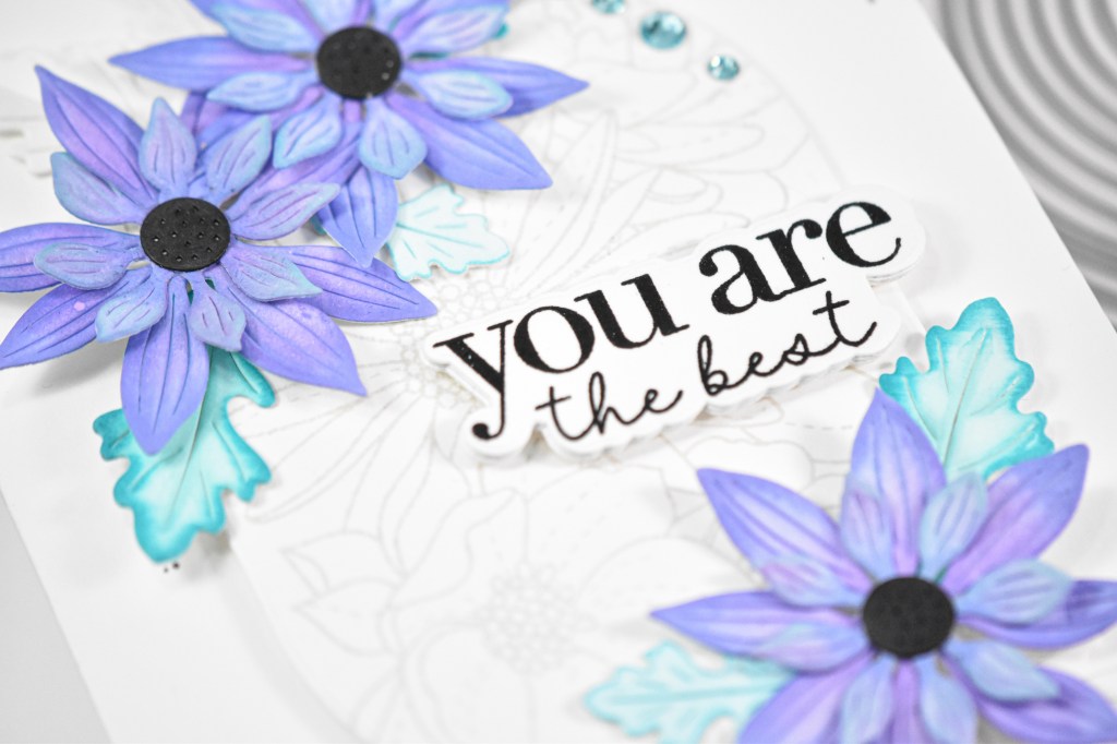
Hi Friends! Thanks for joining me! Today’s project is featuring the new Dewdrop Daisy from Simon’s latest release, Shine On. I had this background lying around from a previous project, and I thought that I could give the daisy a grungy feel for all of these components to work together! Let’s go through the deets!

NOTE: all supplies are linked in the thumbnails at the end of this blog post.
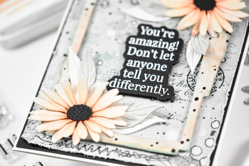
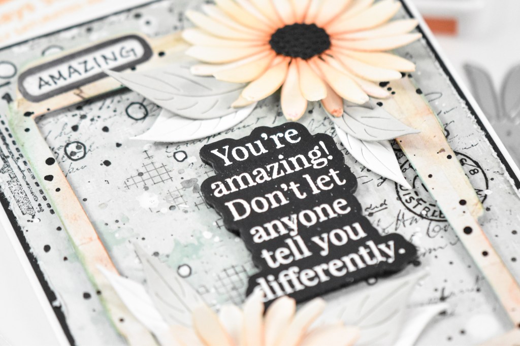
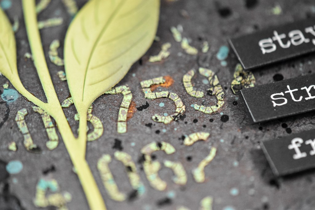
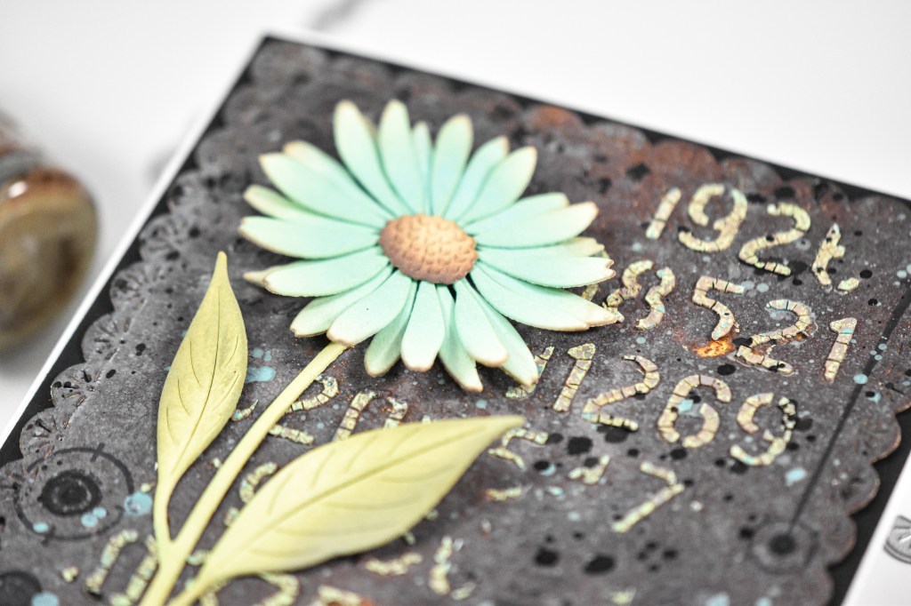
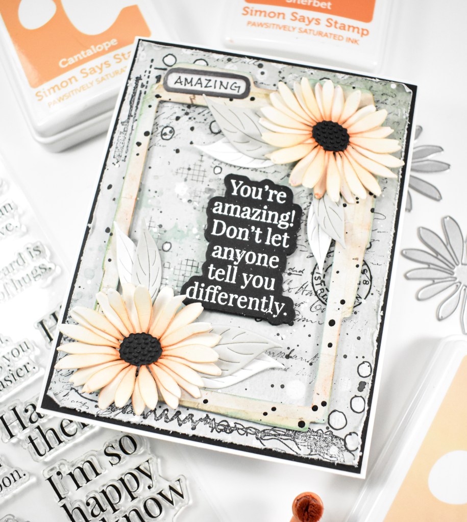
As I said, I already had this background panel, which was created using Distress Oxide Sprays, inks and paint. I die cut the panel using the Sparkler Scallop Frames and did some stamping, stenciling and splattering on it. The daisy was die cut from cream cardstock and ink blended using Distress Oxide Salvaged Patina, Walnut Stain and Peeled Paint.

My background panel was adhered to a black panel for contrast, the stem was glued in place, while the flower and sentiment were adhered with foam tape to finish up.

That’s it for this one! I hope you enjoyed it as much as I did! Make sure to check out the entire Shine On release for a look at all of the new goodies! Thanks for stopping by, and I hope you have an amazing day!

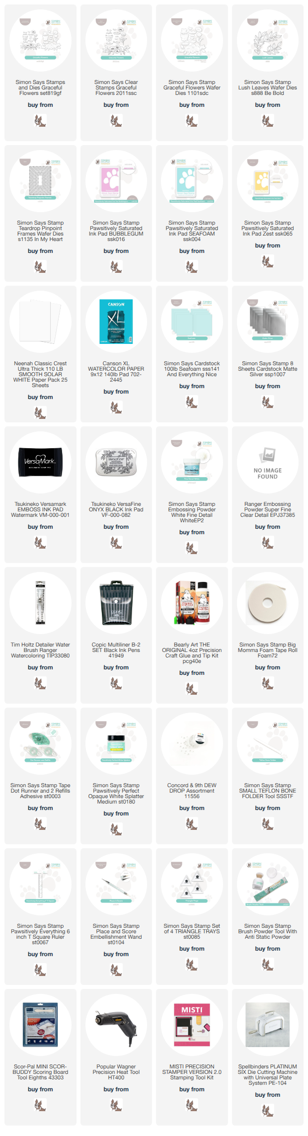
Supply List

Affiliate links used at no cost to you. What does this mean? If you use the links within this post to make a purchase, I receive a small commission, which allows me to continue to post crafty content for your enjoyment. I truly appreciate your support!

Latest Posts

Latest Instagram Posts

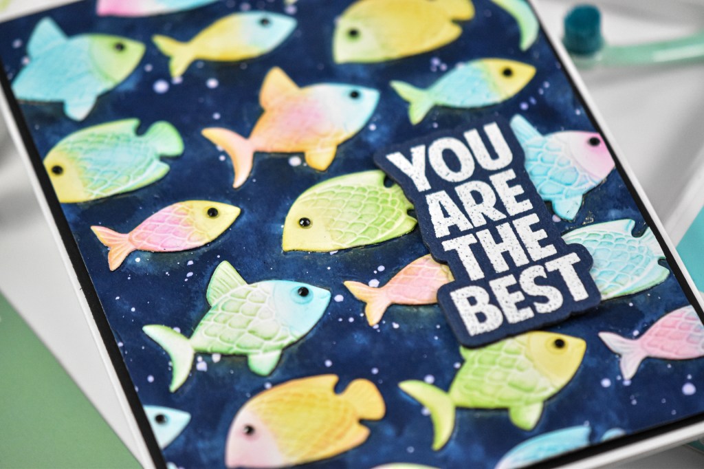
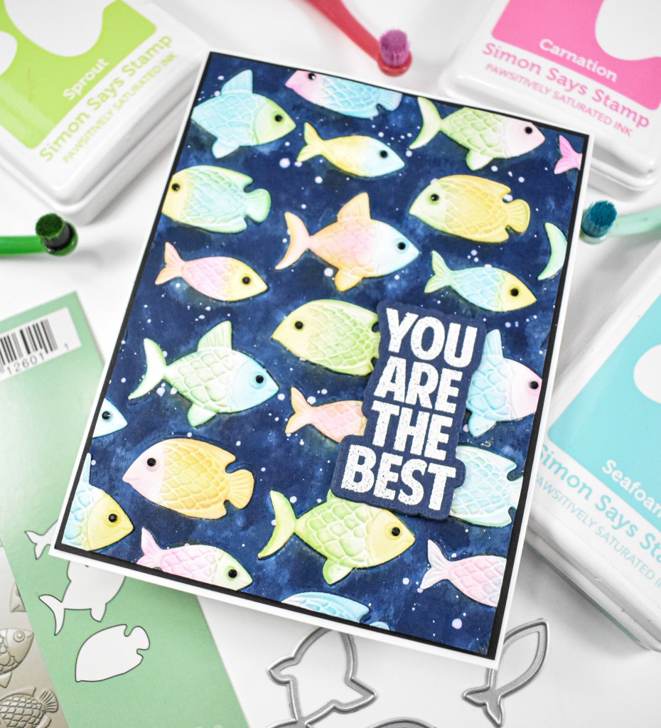
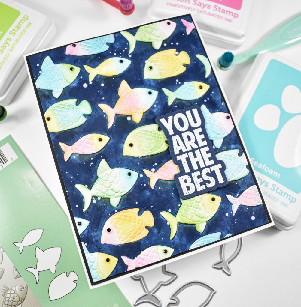
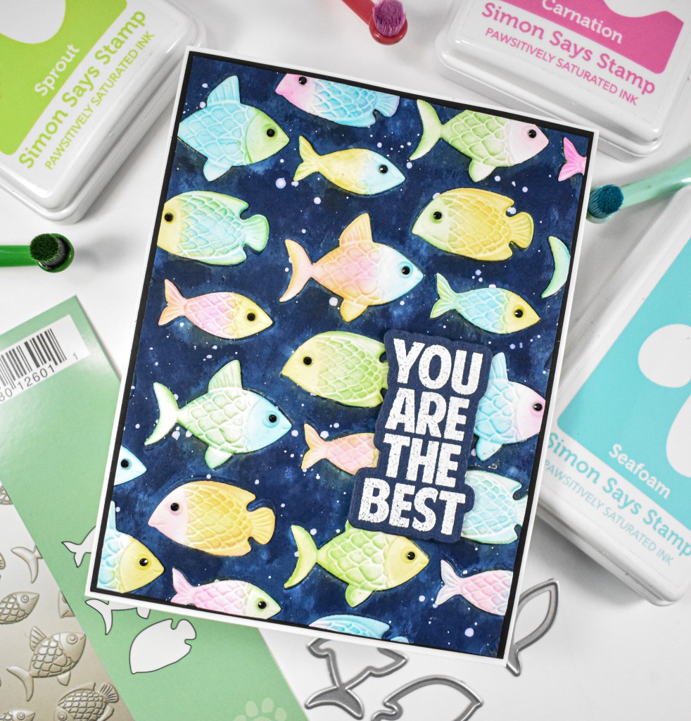
Simon Says Stamp Best Fish

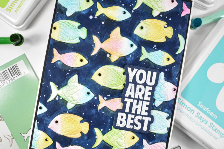
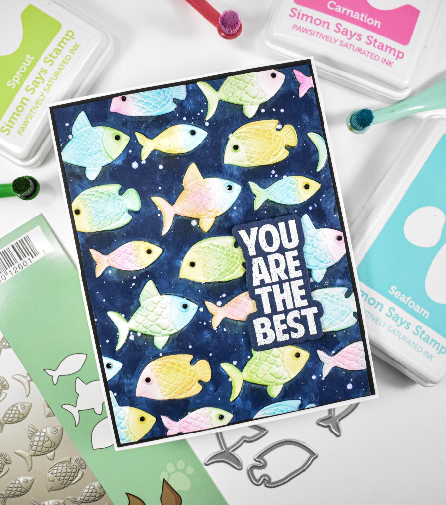
Hello and welcome back! Today’s post is featuring the new Fun Fish Embossing Folder and cutting dies from Simon’s latest release, Shine On. To be honest, I was having a hard time getting any good ideas with the project. I tried doing the “blackout” technique twice and those looked terrible, so rather than just throw the panel away, I decided that I would just do die cutting to cover it all up! Let’s go through the details!

NOTE: all supplies are linked in the thumbnails at the end of this blog post.

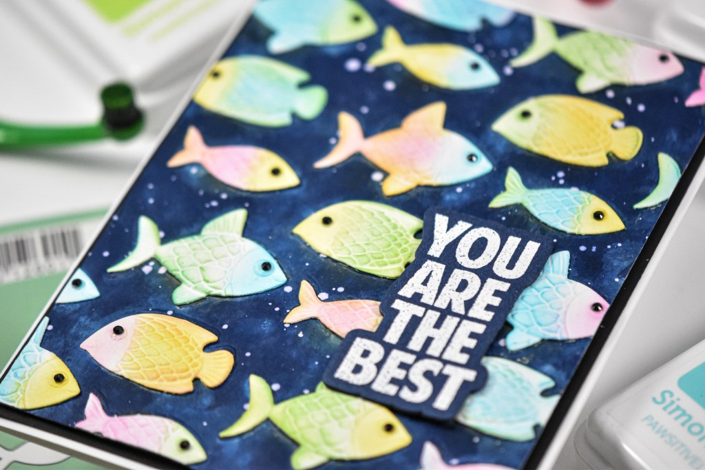
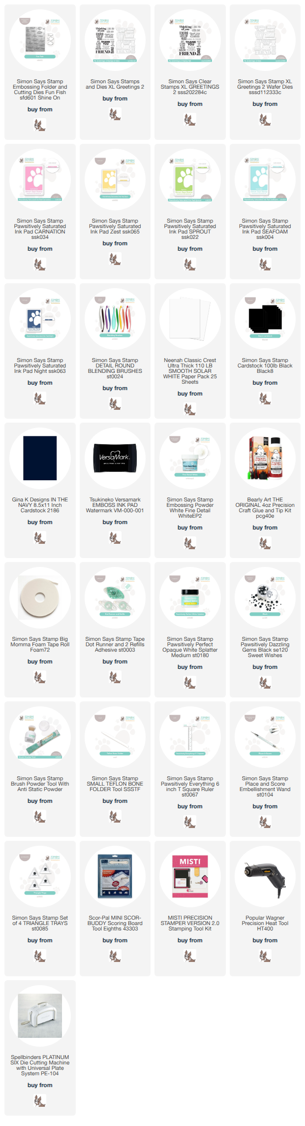
I began by embossing the panel with the folder and using Night ink for the “blackout,” because I wanted it to be blue like the ocean, obviously. I did end up splattering the panel with a little water to get that blotchiness that you see, as well as some white splatter. Before doing all of the fish die cutting, I did try some ink blending on the fish, but it just was not working out, like I said.

I die cut the fish, popped them into the folder, embossed them and then did the ink blending on those using Carnation, Zest, Sprout and Seafoam inks. Once they were all done, I glued them into their coordinating spots on the panel, trimming off the excess. The panel was then adhered to a black panel before being adhered to the card base.

The sentiment was stamped using VersaMark Ink, heat set using white embossing powder and trimmed out several times. The sentiment was adhered using foam tape, and I added tiny black gems for the eyes of the fish to finish up.
That does it for this project! I was really worried that I had wasted this panel, but am proud of myself for pulling something together! Has that ever happened to you? You’re ready to throw it in the trash, but try one last ditch effort and it ends up working out? Thanks again for joining me, and I hope you have an amazing day!
Supply List

Affiliate links used at no cost to you. What does this mean? If you use the links within this post to make a purchase, I receive a small commission, which allows me to continue to post crafty content for your enjoyment. I truly appreciate your support!
Latest Posts

Latest Instagram Posts

Simon Says Stamp Glowing Daisies

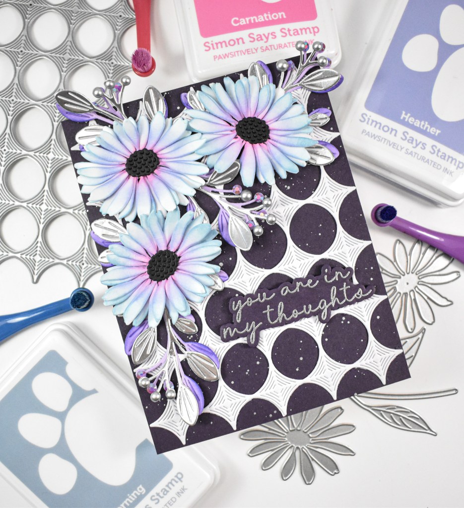
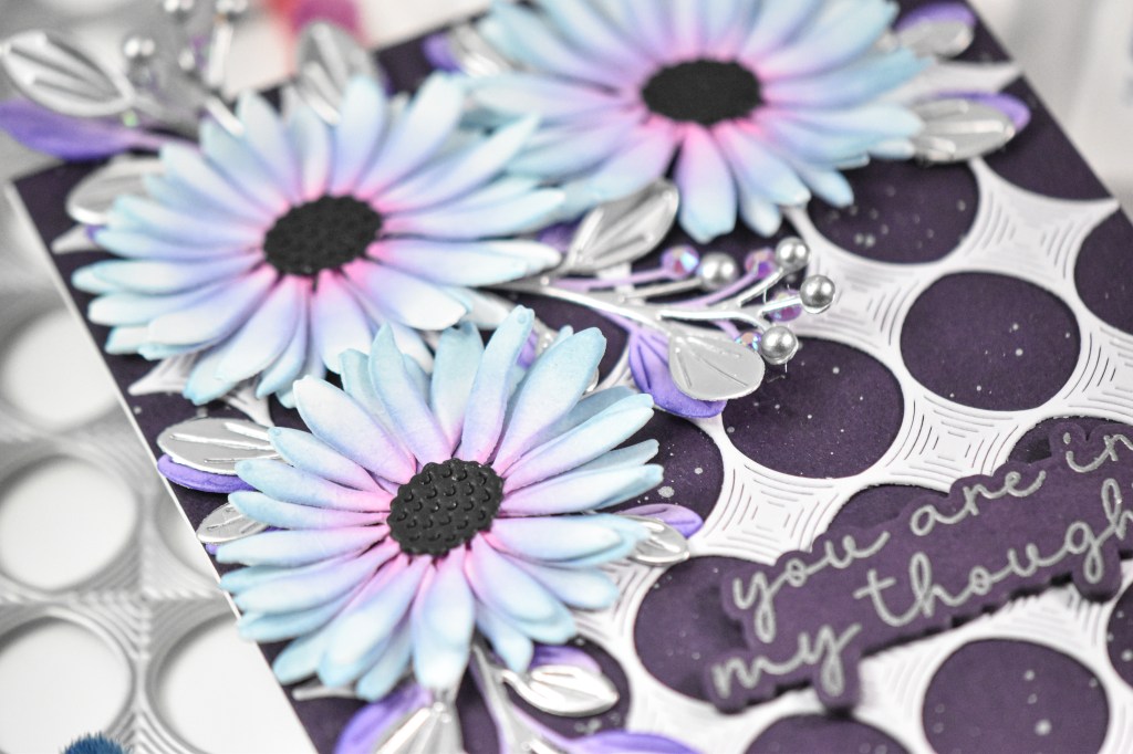
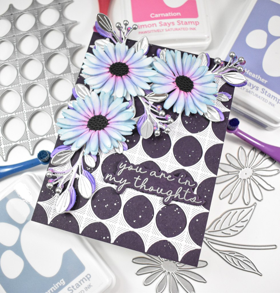
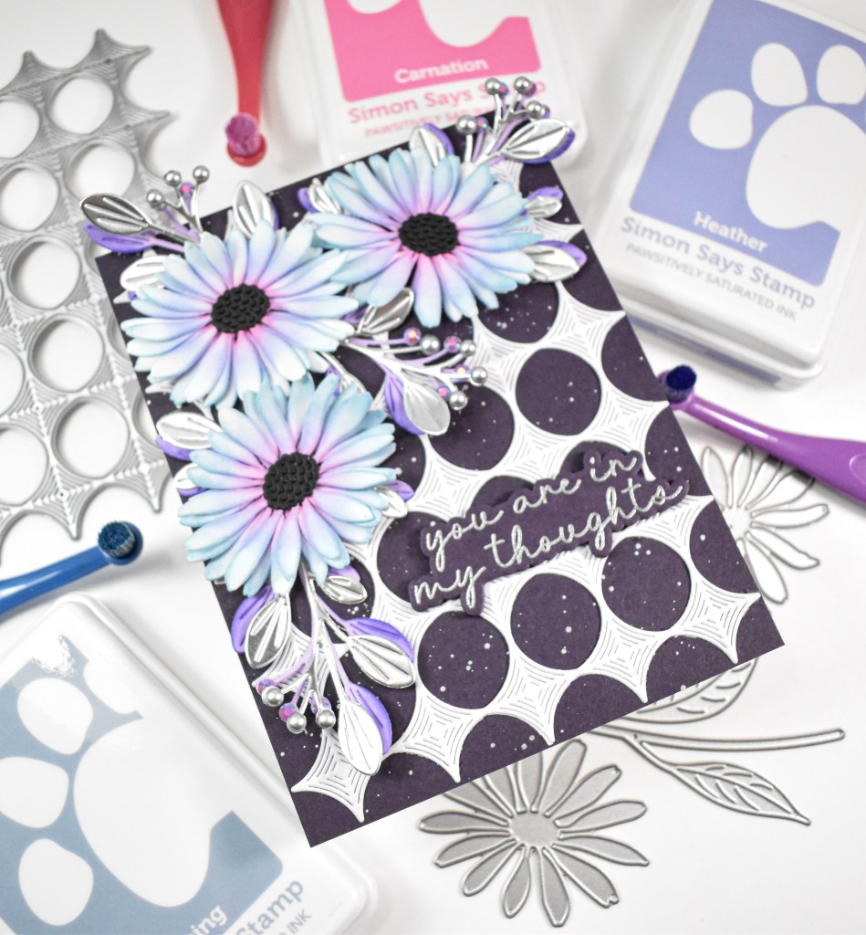
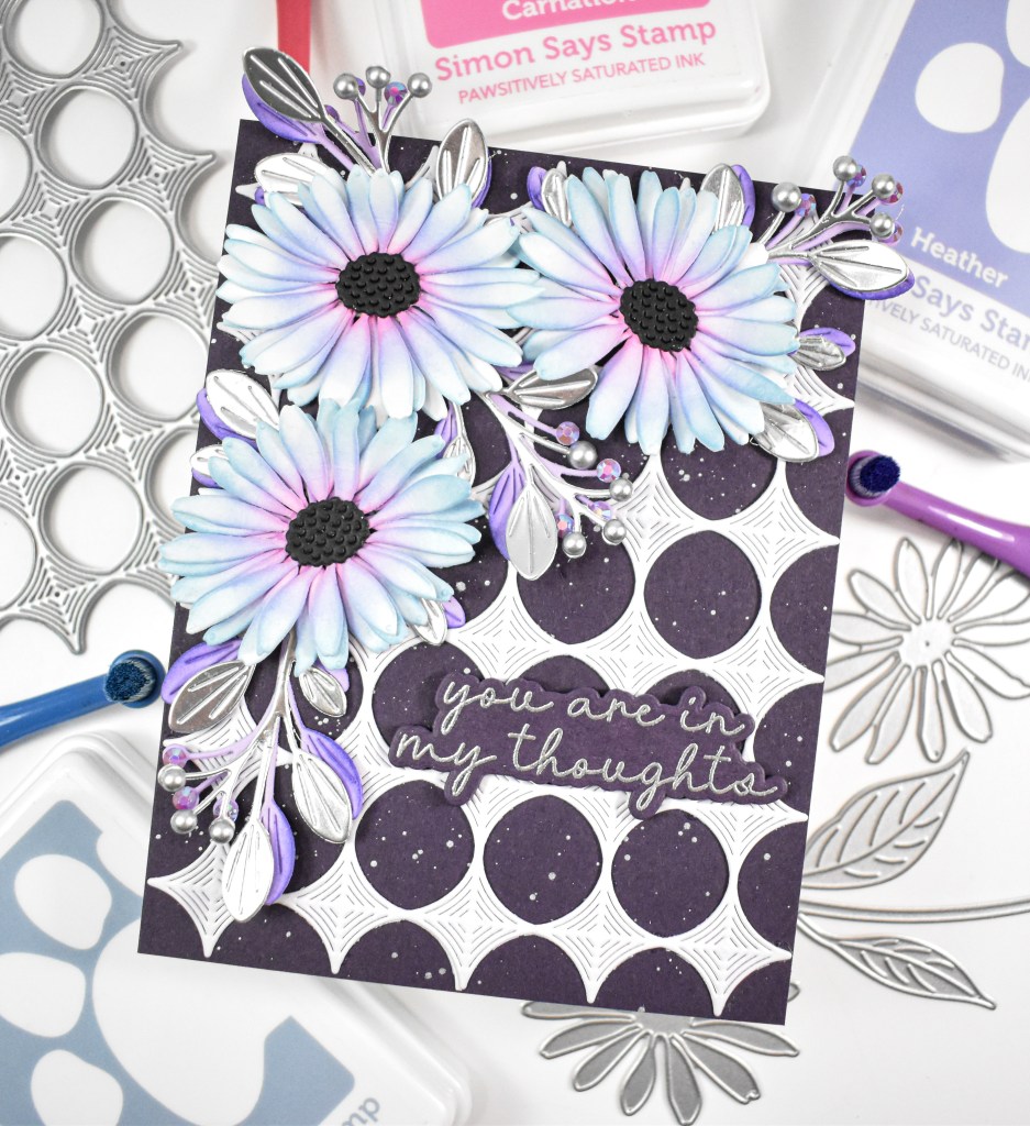
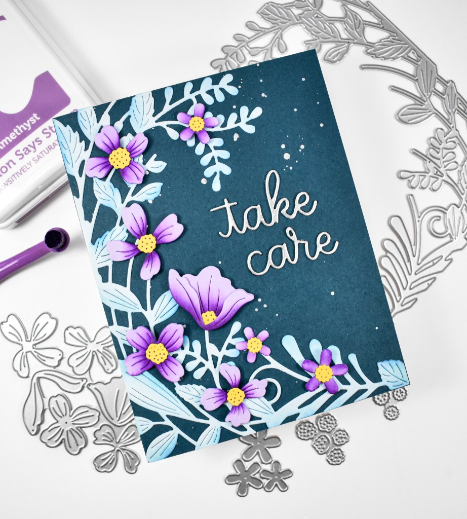
Welcome back to my blog! Today’s project is featuring the Dewdrop Daisy from Simon’s latest release, Shine On. I had seen a photograph of a flower on Instagram that had these stunning colors, and I decided that I was going to try to recreate it with some ink blending! Let’s go ahead and run through the details for this one!

NOTE: all supplies are linked in the thumbnails at the end of this blog post.

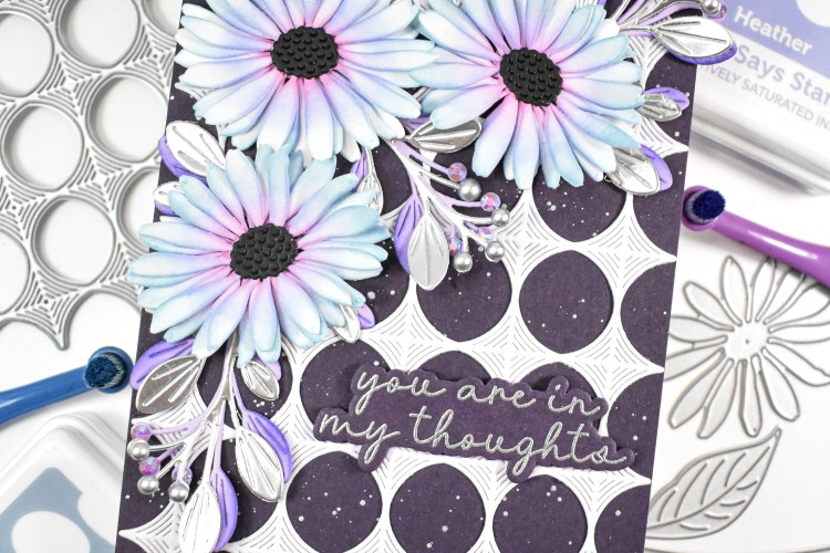
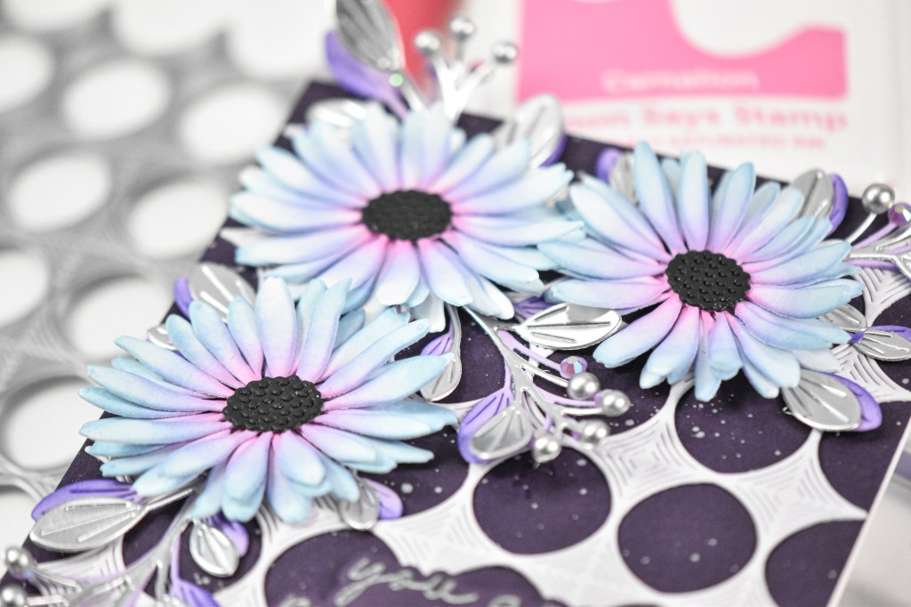
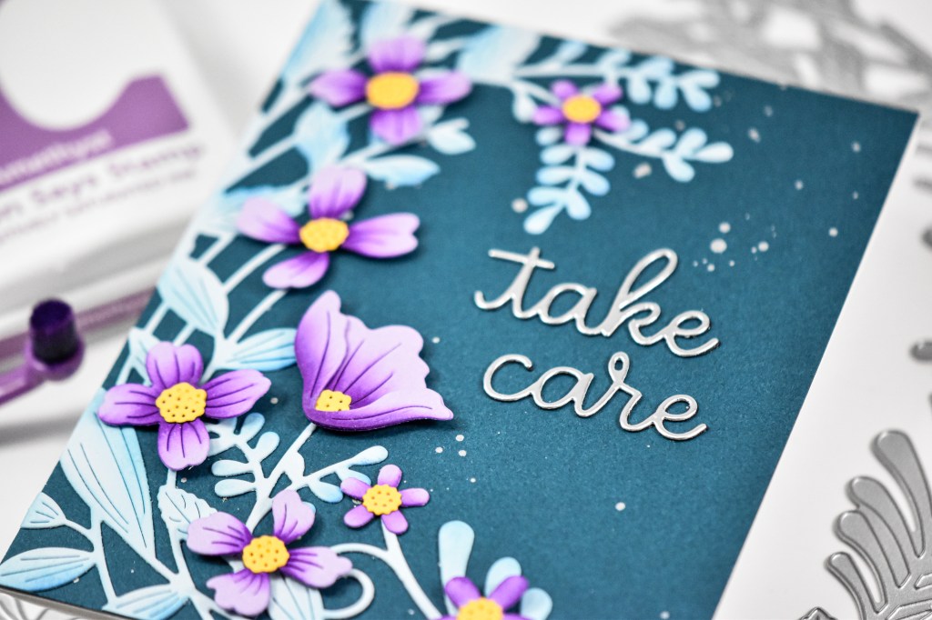
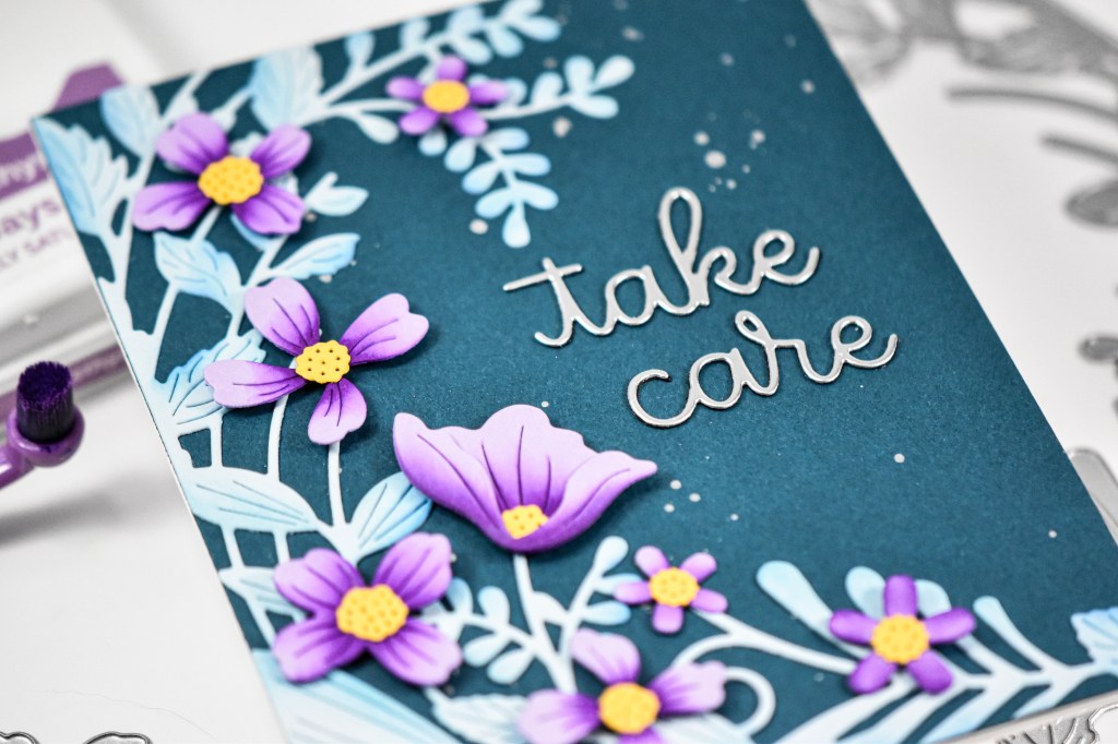
I began by die cutting a bunch of times from Neenah cardstock. The flower has two layers when assembled, but I opted to add an additional layer for more fullness. The ink colors that I used for the flowers were Carnation, Heather and Morning. I started with the Carnation in the center of each piece and then added the Heather just outside of that, and then added the Morning on the ends of the petals. Once done with that ink blending, I glued the pieces together and added the black center piece using foam tape.

My background was created using a plum colored cardstock that was silver splattered before adding the Whirl Diamond Plate that was cut from Moonflower cardstock. If there are flowers, you know that I have to have lots of leaves! I die cut the Budding Branches several times from Lavender cardstock, as well as from matte silver cardstock. The edges of the lavender leaves were ink blended with some Iris ink for some depth and dimension.

I began the assembly by arranging the flowers and securing the purple leaves first and then the silver leaves, just slightly offset so that you could get a glimpse of everything. The flowers were secured with foam tape for added dimension. The sentiment was stamped onto the same plum cardstock using VersaMark ink and heat set using silver embossing powder. It was trimmed out several times, adhered together and then secured to the card front. Because the Budding Branches have spaces for “buds,” I always like adding embellishments there. I added purple crystals to the purple “buds” and matte silver pearls to the silver “buds” to finish up.

That does it for this beauty! When I showed my friend this card, her reply was, “those flowers are glowing,” hence the name of the post! I thought this was a really gorgeous color combination and enjoy putting this card together. Don’t forget to check out the entire Shine On release over on Simon’s website. Thanks again for stopping by, and I hope you have a wonderful day!

Supply List

Affiliate links used at no cost to you. What does this mean? If you use the links within this post to make a purchase, I receive a small commission, which allows me to continue to post crafty content for your enjoyment. I truly appreciate your support!

Latest Posts

Latest Instagram Posts
Simon Says Stamp Amazing Floral

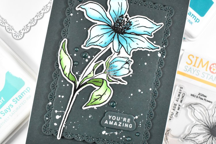
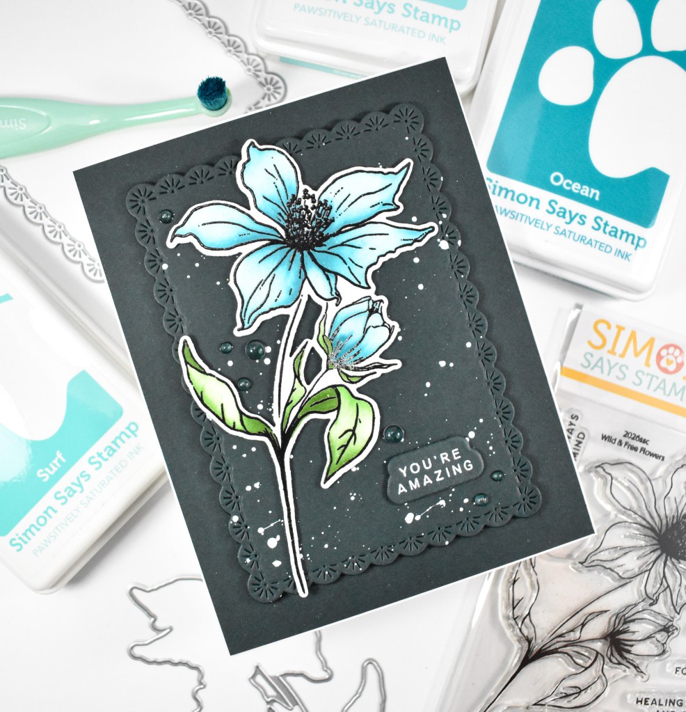
Hello Crafty Friends, and welcome back! I recently ordered the Wild & Free Flowers product suite and promptly made a card with it using some darker colors. Let’s run through the details!

NOTE: all supplies are linked in the thumbnails at the end of this blog post.

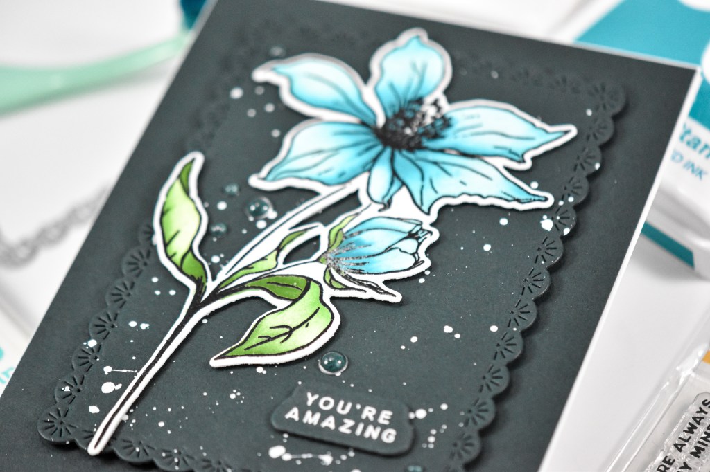
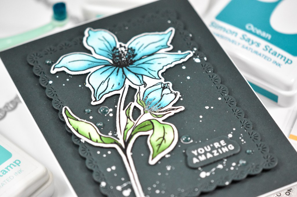
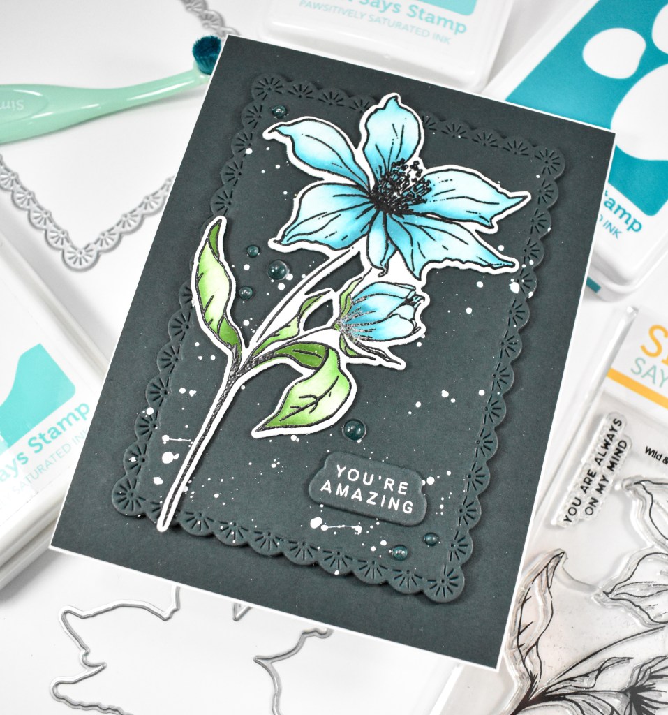
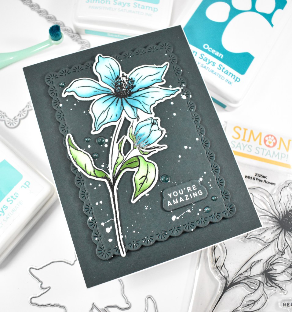
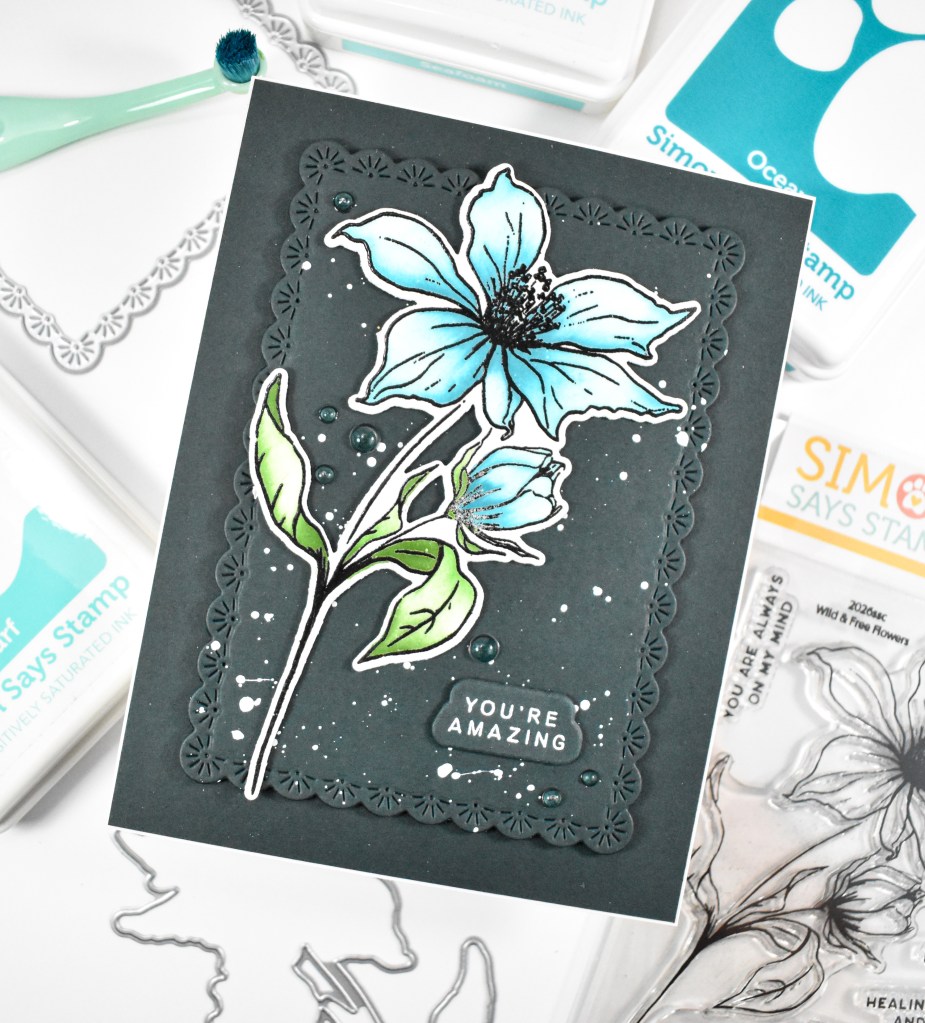
I began this project by stamping one of the florals onto a panel of Neenah cardstock using VersaFine Onyx Black ink and heat setting it with clear embossing powder. I then used the stencils to do some ink blending using Seafoam, Surf, Ocean, Sprout, Fairway and Field. Once that was complete, I used the coordinating dies to trim out the image.

I knew that I wanted a dark background, so I pulled some Forest cardstock and cut a panel of that using the Sparkler Scallop Frames with a good dose of white splatter. I also cut another panel of Forest cardstock for the other background. The sentiment was stamped using VersaMark Ink, heat set using white embossing powder and trimmed out several times for a stacked sentiment.

The splattered background was adhered to the other Forest background using foam tape for a bit of added dimension, while the flower was adhered using thin foam squares, and the sentiment was glued directly to the panel. I added some dew drops to finish up.

That does it for this project! I hope you like it! I really love working with darker colors, but don’t do it that often, so maybe I need to mix that in a bit more! Thanks for stopping by, and I hope you have a wonderful day!

Supply List

Affiliate links used at no cost to you. What does this mean? If you use the links within this post to make a purchase, I receive a small commission, which allows me to continue to post crafty content for your enjoyment. I truly appreciate your support!

Latest Posts

Latest Instagram Posts
Simon Says Stamp Graceful Hugs

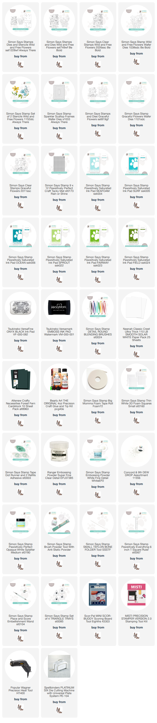
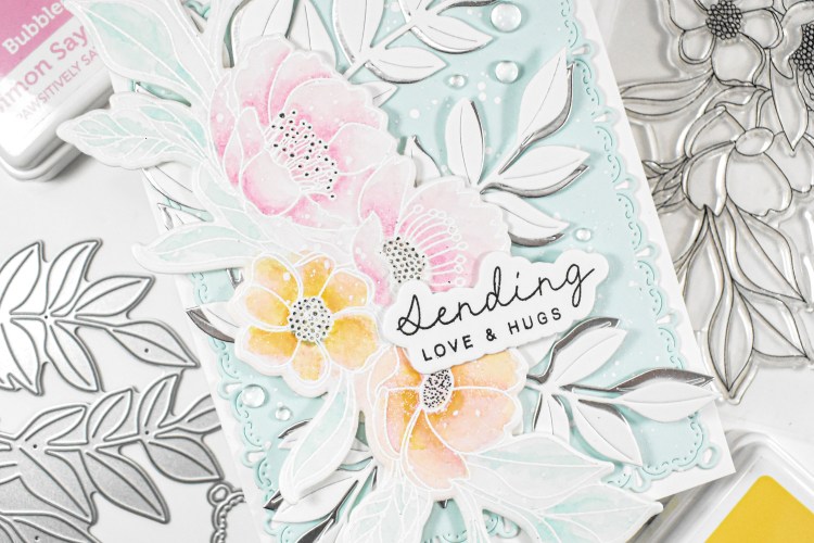
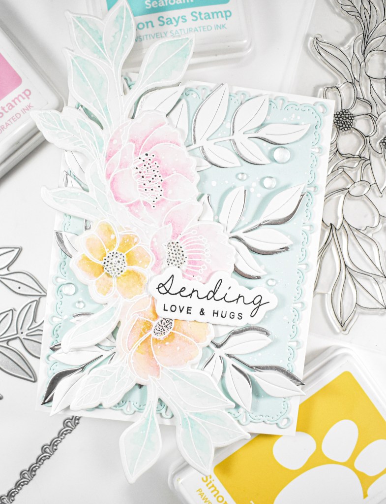
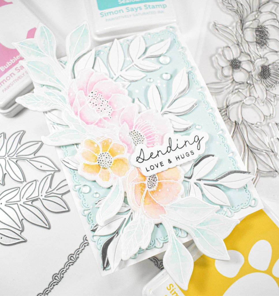
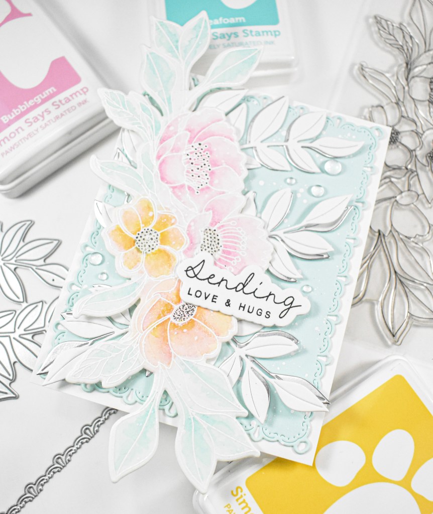
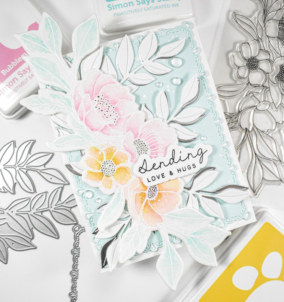
Hello Friends, and welcome back! Today’s post is a pretty, pastel floral featuring the Graceful Flowers stamp set that I picked up while I was at the CREATE event back in April. Let’s go ahead and run through the details!

NOTE: all supplies are linked in the thumbnails at the end of this blog post.

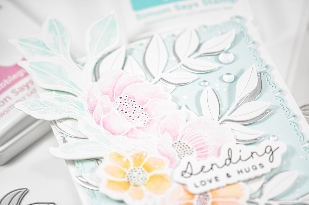
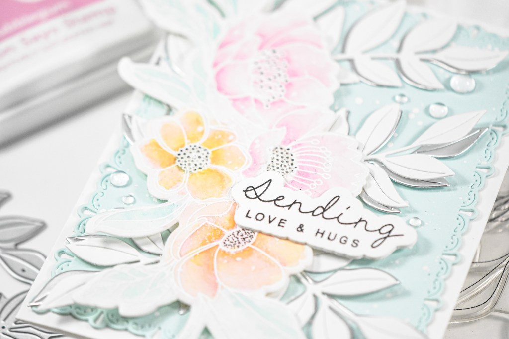
I began this project by stamping the floral onto a panel of watercolor paper using VersaMark ink and heat setting that using white embossing powder. I then pulled the Bubblegum, Seafoam and Zest inks to do some simple watercoloring. I smooshed the ink onto my glass mat and added the ink to the image using a water brush. When done with that, I used the coordinating die to trim it out. I did add a little bit of black detail to the centers of the flowers using a Copic Multliner pen to bring out some of those details.

The background panel was created by cutting a panel of seafoam cardstock using the Teardrop Pinpoint Frames and giving it a good dose of white splatter. You guys know that I always need more leaves, so I pulled the Lush Leaves die and cut that from white and silver cardstock. The sentiment was stamped using VersaFine Onyx Black ink and heat set using clear embossing powder.

The background panel was added to the card base, the silver leaves were secured with liquid glue, then the white leaves, the floral was adhered with foam tape, the sentiment was secured and some dew drops were added to finish up this project.

And, that does it for this project! I hope you enjoyed it as much as I did! I think this is a really pretty color combo and look forward to creating another project using them. Thanks again for joining me, and I hope you have an awesome day!

Supply List

Affiliate links used at no cost to you. What does this mean? If you use the links within this post to make a purchase, I receive a small commission, which allows me to continue to post crafty content for your enjoyment. I truly appreciate your support!

Latest Posts

Latest Instagram Posts
Together By Design Featuring Distress Oxides

Together by Design is a monthly collaboration where a small group of designers all create with products from the same featured brand. Each of us chooses a favorite product and puts our own creative spin on it, showing just how many different ways one brand can inspire. Follow along, explore every project, and discover new designers and new favorites along the way.

This month’s featured brand:  Distress Oxides

NOTE: all supplies are linked to multiple sources in the thumbnails at the end of this blog post.

Here is a list of designers participating this month:

My project got pretty detailed, and I apologize for that, but let’s go ahead and run through the details! I began by creating the background first using Distress Oxide sprays in Vintage Photo, Walnut Stain and Broken China. I did also use regular Distress spray in Gathered Twigs. I was drying my panel between ink applications, so that I would get some good color variations. Once I was satisfied with the background, I did some stamping using various Tim Holtz sets from my stash, and trimmed it down using A2 Postage Rectangles. I knew that I wanted some texture as well, so I mixed some Ranger Transparent Texture Paste with some Distress Salvaged Patina Paint and added that through the TCW Mini Well Rounded Stencil. I’m not even sure if this stencil is still available, but any stencil that you love would work just great!

For the focal image, I stamped the Floral Trims stamp onto a panel of watercolor paper using VersaFine Onyx Black ink and heat set that using clear embossing powder. I then did some watercoloring using Distress Oxide ink pads in Salvaged Patina and Walnut Stain. While I was creating my background panel, I went ahead and created another panel that I used to cut the frame surrounding the floral. That was trimmed out using the same postage set and adhered to the floral.

The background panel was adhered to a black panel for contrast, and then adhered to the card base. I added some bits from the Tim Holtz Curator Ephemera Pack, as well as some Field Notes PET Tape from 49 and Market. The floral was adhered using foam tape and some black butterflies were added to tie in all of the black stamping. The sentiment is from the Tim Holtz Theories Quote Chips set that I added some Salvaged Patina ink to and then heat embossed it with clear embossing powder to give it a bit of shine.

That does it for this project! I hope you enjoyed it, and I hope you’ll stop by again next month to find out what our featured product or brand will be! Thanks so much for stopping by, and I hope you have a fabulous day!

Supply List

Affiliate links used at no cost to you. What does this mean? If you use the links within this post to make a purchase, I receive a small commission, which allows me to continue to post crafty content for your enjoyment. I truly appreciate your support!

Latest Posts

Latest Instagram Posts
Simon Says Stamp Black Out Peony

Hello Friends, and welcome back to my blog! Today’s project is once again featuring the Peony and Bells Embossing Folder and Die from Simon’s latest release, Always There. Let’s get into the details!

NOTE: all supplies are linked in the thumbnails at the end of this blog post.

I began this project by embossing the folder onto a panel of Neenah 110lb cardstock and ink blending using Bubblegum, Carnation and Celery inks. Once satisfied with the ink blending, I used a black ink pad to rub over the raised portion of the panel.

The sentiment was stamped onto black cardstock using VersaMark ink and heat set using white embossing powder. I used the coordinating die to trim it out three times for a stacked sentiment.

The sentiment and dew drops were secured with liquid glue to finish up this project. A super simple project, but I love the look of the black next to the pink and green!

Thanks for stopping by to check out this project! Be sure to check out the entire Always There release over on Simon’s website. Have yourself an awesome day!

Supply List

Affiliate links used at no cost to you. What does this mean? If you use the links within this post to make a purchase, I receive a small commission, which allows me to continue to post crafty content for your enjoyment. I truly appreciate your support!

Latest Posts

Latest Instagram Posts
Simon Says Stamp Artsy Butterflies Text

Hello Friends, and welcome back! I’m so glad you stopped by today to check out this project featuring the Artsy Butterflies. Let’s get right into the details!

NOTE: all supplies are linked in the thumbnails at the end of this blog post.

If you’re like me, you’re hoarding patterned paper like it’s never going to be made again, am I right?! I decided that I would part with a little bit of it, and stamp the Artsy Butterflies onto a panel of pastel marble paper from P13 using VersaFine Onyx Black ink and heat set it with clear embossing powder. I then used the coordinating dies to trim them out, along with a black layer as well. I will link to a similar patterned paper at the bottom of this post.

The background is a combination of things with the bottom layer being a panel of ColorBlend cardstock that was black splattered and then a panel of Dina Wakely transparency that I smeared with Distress Paint.

The sentiment was stamped using VersaMark ink, heat set using detail white embossing powder and trimmed out with three additional cuts for a stacked sentiment. I adhered the black butterfly to the stamped butterfly using foam squares, and then those were adhered to the transparency using strong double sided tape. To adhere the transparency to the colored panel, I put some strips of the same tape on the backside underneath the butterflies so that you wouldn’t be able to see it. The sentiment was secured with the same tape as well.

That does it for this project. I hope you enjoyed it, and I hope you have a great day!

Supply List

Affiliate links used at no cost to you. What does this mean? If you use the links within this post to make a purchase, I receive a small commission, which allows me to continue to post crafty content for your enjoyment. I truly appreciate your support!

Latest Posts

Latest Instagram Posts
Simon Says Stamp Grateful Heart

Hello Friends, and welcome back! Today’s post is featuring the new Crocus Duo from Simon’s latest release. This ended up being a twofer project, but I’m only writing about one of them today, so let’s go ahead and go through the details.

NOTE: all supplies are linked in the thumbnails at the end of this blog post.

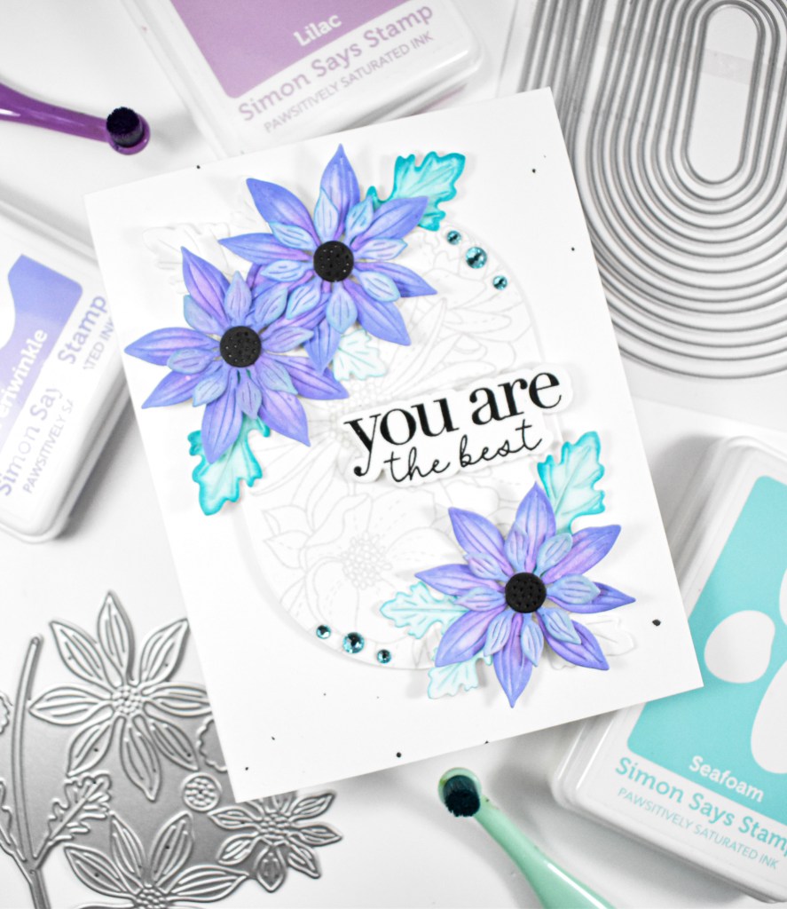
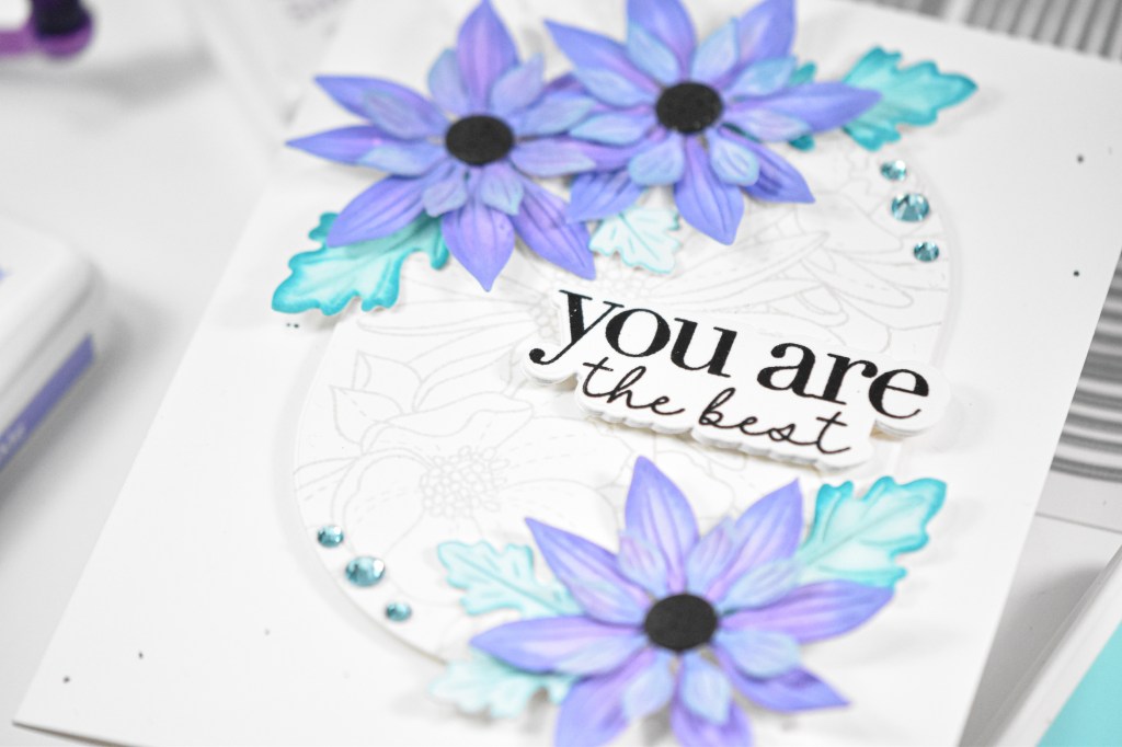
I knew that I wanted my Crocus flowers to be purple, so I die cut the flowers several times from three different colors of purple cardstock. Once I had cut all of the flowers, I did some ink blending on them using Crocus and Lilac inks, and assembled them. The flowers are only two layers, but I cut an additional layer to be adhered to the back. While I was cutting, I did cut the stems and grass from green cardstock.

My background was created using a very old Simon background stamped onto a very pale blue cardstock using VersaMark Ink and heat embossing it with white powder. This is where the twofer part comes in to play. I die cut that blue panel using the Whirl Diamond Plate, but only used the inner circles for this project. I also die cut a panel of Moonflower cardstock using that same plate. Before assembling this part, I decided that I wanted those inner circles black splattered.

This background ended up being a little bit of work, but I think it was worth it in the end. I went ahead and glued the Moonflower panel to the card base, and inlaid the splattered blue circles. After playing with the flower arrangement, I decided that it might be pretty to add some grass pieces that were similar to the other cardstock colors that I was using.

The flowers were adhered using foam tape, while the stems and various leaves were secured with liquid glue. The sentiment was stamped, white heat embossed, trimmed out and adhered to the panel with glue as well. To finish up, I added some dew drops for added interest.

That does it for this project. I hope you like it! I’ll post the other project using the rest of the background at some later date. Thanks again for stopping by, and I hope you have an awesome day!

Supply List

Affiliate links used at no cost to you. What does this mean? If you use the links within this post to make a purchase, I receive a small commission, which allows me to continue to post crafty content for your enjoyment. I truly appreciate your support!

Latest Posts

Latest Instagram Posts
Together By Design Color Cube Floral

Together by Design is a monthly collaboration where a small group of designers all create with products from the same featured brand. Each of us chooses a favorite product and puts our own creative spin on it, showing just how many different ways one brand can inspire. Follow along, explore every project, and discover new designers and new favorites along the way.

This month’s featured brand:  The Color Cubes – #193

Here is a list of designers participating this month:

NOTE: all supplies are linked to multiple sources in the thumbnails at the end of this blog post.

I began my project by gold foiling the Pinkfresh Plumeria Press Plate twice. I did it twice, because I wasn’t sure if I was going to use one or two on my card. Once the foiling was complete, I pulled the inks that I thought best matched the featured card number. I began my ink blending using the coordinating stencils and then trimmed them out using the coordinating dies.

The backgrounds was created by gold splattering the Ornate Banner and the Stitched Basket Weave.. As I always say, I needed more leaves, so I cut the Curvy Leaves from Peridot and Gold cardstock. Unfortunately, I was unable to locate the banner and leaves to link to, but just use items in your stash!

The banner and panel were adhered to the card bases, the leaves were secured in place using liquid glue and the floral panel was adhered with foam tape. The sentiments were gold foiled as well, added with foam tape, and some gold metallic pearls were added to tie it all together and finish up.

That does it for this month’s project! I hope you enjoyed it, and I hope you’ll go check out the other designer’s projects using this same card number from the Color Cubes. Thanks for stopping by, and I hope you have a wonderful day!

Supply List

Affiliate links used at no cost to you. What does this mean? If you use the links within this post to make a purchase, I receive a small commission, which allows me to continue to post crafty content for your enjoyment. I truly appreciate your support!

Latest Posts
Latest Instagram Posts